Before…
前段时间封装了mobile-cascade 组件,详见Mobile 端的级联选择单多选组件实现,有很多的弊端,例如前置依赖了其他的 UI 库基础组件(input/checkbox/tabs...),此外功能相对较单一(不支持 remote/checkStrictly/single...等模式)…
由于需求迭代,需要在移动端实现一个类似于 pc-tree 的组件,因此在前者的基础上进行了二次封装和优化,最终实现了 mobile-tree 组件。
从0到 1
准备用于显示的
cell、icon、checkbox、tabs...等基础组件实现已知选项
data的tree静态渲染支持
fieldProps字段映射,根据树节点的映射配置渲染节点名称和是否禁用、选中…支持
lazy模式,可参考其他UI组件库实现,通过emit:click事件,由外部加载新的数据结构,动态更新options支持
checkStrictly模式,是否严格遵守父子组件不互相关联。支持
single模式,是否将绑定的value值限制为当前节点而不关联前置路径支持
multiple多选模式…如果有其他需求可以继续扩展
基于vue3实现
<script setup lang="ts">
import { cloneDeep } from 'lodash';
interface MobileTreeProps {
// 单选时值为路径数组string[],多选为string[][],若为single模式则类型为[string] | [string][],此时string为节点自身value
value: string[] | string[][];
fieldProps: Record<NodeField, string>;
options: InnerOption[];
// 非 single 模式下 v-model 包含各个层级节点 value,splitChar 用于分割绑定的当前节点值和其父级节点值
splitChar?: string;
multiple?: boolean;
// 是否严格遵守父子不互相关联,默认为 false,若父节点可选,此时选中父节点会同时选中子节点且此时绑定的 value 只会统计叶子节点
checkStrictly?: boolean;
// single 模式绑定值为选项自身 value,不包含前置路径,选项不跟踪父级节点
single?: boolean;
// lazy 模式 nodeChildrenLoad 必传,用于加载子节点
lazy?: boolean;
nodeChildrenLoad?: (node: InnerOption) => Promise<void>;
}
const ROOT = '__$ROOT$__';
const props = withDefaults(defineProps<MobileTreeProps>(), {
splitChar: '|',
nodeChildrenLoad: () => () => Promise.resolve(),
});
const emits = defineEmits<{
(e: 'input', value: string[] | string[][]): void;
(e: 'nodeClick', node: InnerOption): void;
}>();
const activeTab = ref(0);
const currentSelectPath = ref<string[]>([]);
const valueSync = useVModel(props, 'value', emits, { eventName: 'input' });
const selectableOptions = computed(() => {
return [ROOT, ...currentSelectPath.value]
.map((p, idx, arr) => getOptionChildrenByPath(arr.slice(0, idx + 1)))
.filter((o) => !!o.length);
});
onMounted(() => {
currentSelectPath.value = (
props.multiple ? valueSync.value[0] ?? [] : valueSync.value
) as string[];
});
function getOptionChildrenByPath(path: string[]) {
return path.reduce((prev, current) => {
if (current !== ROOT) {
return (
prev.find((o) => o[props.fieldProps.value] === current)?.[props.fieldProps.children] ?? []
);
}
return prev;
}, props.options);
}
function getTabPrePath(tabIdx: number) {
return currentSelectPath.value.slice(0, tabIdx).join(props.splitChar);
}
function getTabTitle(tab: InnerOption[], tabIdx: number) {
return (
tab.find(
(o) =>
o[props.fieldProps.value] &&
o[props.fieldProps.value] === currentSelectPath.value[tabIdx],
)?.[props.fieldProps.label] ?? '---'
);
}
function checkHasSelectedNode(option: InnerOption, tabIdx: number) {
const values = pathsArr2PathsStr(valueSync.value);
const prePath = getTabPrePath(tabIdx);
const checkableValues = findAllCheckableNodeValues(option, prePath);
return checkableValues.some((v) => values.includes(v));
}
async function optionClickHandle(option: InnerOption, tabIdx: number) {
emits('nodeClick', option);
if (!optionIsLeafNode(option) && props.lazy) {
await props.nodeChildrenLoad?.(option);
}
// 避免非常规常规节点影响
if (option[props.fieldProps.value]) {
currentSelectPath.value = currentSelectPath.value
.slice(0, tabIdx)
.concat([option[props.fieldProps.value]]);
if (!optionIsLeafNode(option)) {
// update tab after tabs(dependencies currentSelectPath) rerender.
await nextTick();
activeTab.value = tabIdx + 1;
}
}
}
function getOptionSelectedStatus(option: InnerOption, tabIdx: number) {
const checkedValues = getOptionCheckedValues(option, tabIdx);
const values = pathsArr2PathsStr(valueSync.value);
const selectAll = checkedValues.every((p) => values.includes(p));
const indeterminate = !selectAll && checkedValues.some((p) => values.includes(p));
return { selectAll, indeterminate };
}
async function optionSelectChange(option: InnerOption, tabIdx: number) {
// 严格模式下只切换当前节点选中状态
const checkedValues = getOptionCheckedValues(option, tabIdx);
const value = pathsArr2PathsStr(valueSync.value);
const normalValues = value.filter((v) => !checkedValues.includes(v));
const newChecked = !checkedValues.every((p) => value.includes(p));
if (props.multiple) {
valueSync.value = pathsStr2PathsArr(
newChecked ? [...normalValues, ...checkedValues] : normalValues,
);
} else {
// checkedValues 会包含节点自身,不存在为 [] 的情况
valueSync.value = pathsStr2PathsArr(newChecked ? [checkedValues[0]] : []);
}
}
function getOptionCheckedValues(option: InnerOption, tabIdx: number) {
const prePath = getTabPrePath(tabIdx);
const checkableValues = findAllCheckableNodeValues(option, prePath);
const optionValue: string =
prePath && !props.single
? `${prePath}${props.splitChar}${option[props.fieldProps.value]}`
: option[props.fieldProps.value];
// 严格模式下只切换当前节点选中状态
return props.checkStrictly ? [optionValue] : checkableValues;
}
function pathsArr2PathsStr(v: string[] | string[][]): [string] | string[] {
const tv = props.multiple ? v : v.length ? [v] : [];
return tv.map((o) => (o as string[]).join(props.splitChar));
}
function pathsStr2PathsArr(val?: [string] | string[]) {
const tv = val?.map((v) => v.split(props.splitChar)) ?? [];
return props.multiple ? tv : tv[0] ?? [];
}
function optionIsLeafNode(option: InnerOption) {
// 支持配置 leaf 控制是否为叶子节点,否则通过 children.length 判断
return typeof option[props.fieldProps.leaf] === 'boolean'
? option[props.fieldProps.leaf]
: !option[props.fieldProps.children]?.length;
}
function checkboxShown(option: InnerOption) {
// 非常规节点
if (!option[props.fieldProps.value]) return false;
// 传入了 checkAble 控制
if (typeof option[props.fieldProps.checkAble] === 'boolean')
return option[props.fieldProps.checkAble];
// 默认节点可选:多选以及非严格模式(父子关联,选父表示选择所有子,不含自身),所有节点可选,叶子节点可选
return props.multiple || props.checkStrictly || optionIsLeafNode(option);
}
function validateNodeSelfCheckable(node: InnerOption) {
// 与 checkboxShown 不同的是,checkboxShown 只针对是否显示多选框(比如非严格模式下的父节点,选中只是同时选中所有子节点,但并不包含自身)
if (!checkboxShown(node)) return false;
// 校验当前可选项是否可以包含自身
return props.checkStrictly || optionIsLeafNode(node);
}
// if option is a leaf node, it's includes itself. and only one
function findAllCheckableNodeValues(root: InnerOption, prePath = '') {
const values: string[] = [];
const queue: Array<InnerOption & { prePath: string }> = cloneDeep([{ ...root, prePath }]);
while (queue.length > 0) {
const node = queue.shift()!;
const nodeValue = node[props.fieldProps.value];
const optPathValue = node.prePath
? `${node.prePath}${props.splitChar}${nodeValue}`
: nodeValue;
const optVal = props.single ? nodeValue : optPathValue;
if (node[props.fieldProps.children]?.length) {
queue.push(
...node[props.fieldProps.children].map((n: Record<string, string>) => ({
...n,
prePath: optPathValue,
})),
);
}
if (validateNodeSelfCheckable(node)) values.push(optVal);
}
return values;
}
</script>
<script lang="ts">
import type { CascaderOption } from 'element-ui/types/cascader';
export interface InnerOption extends CascaderOption {
[k: string]: any;
}
export type NodeField = 'label' | 'value' | 'checkAble' | 'leaf' | 'loading' | 'children';
export default {
name: 'MobileTree',
};
</script>
<template>
<van-tabs
v-model="activeTab"
class="p-6"
color="#02A7F0"
title-active-color="#02A7F0"
title-inactive-color="#000"
:swipe-threshold="3">
<van-tab
v-for="(tab, tabIdx) in selectableOptions"
:key="`${getTabPrePath(tabIdx)}_${tabIdx}`"
:title="getTabTitle(tab, tabIdx)">
<van-cell-group class="option-wrapper" :border="false">
<van-cell
v-for="(option, optionIdx) in tab"
:key="`${tabIdx}-${optionIdx}-${option[fieldProps.value]}`"
:title="option[fieldProps.label]"
:title-class="{
'text-ellipsis': true,
'pr-20': true,
featureNode: !option[fieldProps.value],
selectedCell: checkHasSelectedNode(option, tabIdx),
}"
clickable
class="ptb-10"
@click="optionClickHandle(option, tabIdx)">
<template #icon>
<el-checkbox
v-if="checkboxShown(option)"
:value="getOptionSelectedStatus(option, tabIdx).selectAll"
:indeterminate="getOptionSelectedStatus(option, tabIdx).indeterminate"
class="plr-10"
@click.native.stop
@change="optionSelectChange(option, tabIdx)" />
<i v-else-if="!optionIsLeafNode(option)" class="plr-10 lh-24 el-icon-caret-right" />
</template>
<template #right-icon>
<i v-show="option[fieldProps.loading]" class="isLoading el-icon-loading" />
<van-icon v-if="!optionIsLeafNode(option)" name="arrow" class="arrow-icon" size="16" />
</template>
</van-cell>
</van-cell-group>
</van-tab>
</van-tabs>
</template>
<style lang="less" scoped>
.p-6 {
padding: 0 6px !important;
}
.lh-24 {
line-height: 24px !important;
}
.option-wrapper {
height: 350px;
overflow-y: auto;
}
.selectedCell {
color: #409eef;
}
.featureNode {
text-align: center;
width: 75%;
text-align: center;
font-size: 12px;
color: #409eff;
&:hover {
color: #66b1ff;
}
}
.arrow-icon {
position: absolute;
right: -5px;
top: 14px;
}
.isLoading {
position: absolute;
right: 10px;
top: 15px;
}
/deep/.van-cell:active {
background: #f2f3f5;
}
/deep/.van-tab {
padding: 0 10px !important;
margin: 0 5px 0 0 !important;
flex: 0 0 auto !important;
& + & {
&::before {
content: '>';
position: absolute;
left: -7px;
top: 28%;
}
}
}
/deep/.van-tabs__line {
display: none;
}
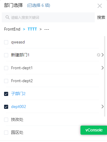
</style>最终效果
这个功能需求并没有相应的 ui 设计,是由我参考其他类似数据结构的移动端组件效果图实现,效果图可能不是特别好,但麻雀虽小…五脏俱全